Audio Mix Matrix
Audio Matrix mixer with N inputs (as lines) and M outputs (as columns).
See panel-matrix for common matrix settings.
Settings
in
Audio input flow(s).
out
Audio output flow(s).
Matrix general
Module to display or edit values of an array.

Settings
matrix type
Sets the type of the matrix:
-
switch: cells are switch and can take the value 0 or 1.
-
fader: cells are continuous value in the range [0..1].
exclusive mode
Determines the exclusion mode, used to allow only one active cell per line or column.
- disabled : no exclusive mode
- per line : only one active cell per line.
- per column : only one active cell per column.
- all : only one active cell in the entire matrix.
this option is only used for switch matrix type.
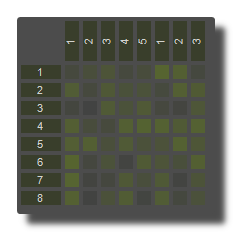
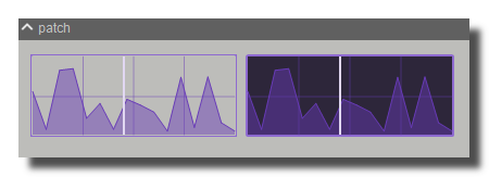
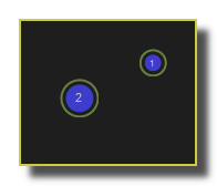
 example of per line exclusive mode
array
Array input or output containing values. The size of the array is nb lines x nb columns ordered line by line.
[(line1, col1),(line1,col2),...,(line1,colN),(line2,col1),..., (lineN,col1),...(lineN,colN)]
The value is always in the range [0..1].
nb lines
Number of lines of the array editor or the matrix.
nb columns
Number of columns of the array editor or the matrix.
precision
Precision of the displayed numeric value, from integer up to five digits precision.
For example 1 1.1 1.11 1.111 1.1111 1.11111
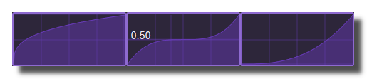
caption
Displayed caption of the object. Click to enter a new name.
reset value
Reset value applies when the reset button is pressed or when the user does a [ctrl+click].
for the matrix, the reset value must be in the range [0..1].
reset
Resets all the values of the selected object.
It resets to the reset value value for controls and to their default values for panels.
randomize
Randomizes the array, fill the array with random value in the range [0..1].
randomize coverage
Amount of cells which are randomized by the randomize operation. For 0, no cells are randomized, for 1 all cells are randomized.
cells captions
Captions of the cells as a comma-text.
cells color
Foreground colors of the cells.
cells background color
Background colors of the cells.
cells mode
Mode used to fill the cells color input.
- disabled: the color input has no effect and the settings colors of the panel are used instead.
- line: colors are filled by lines.
- columns: colors are filled by columns.
- cells: colors are filled cell by cell from top left cell to bottom right cell
line headers captions
Captions of the line headers as a comma-text.
line headers color
Color or color array of the line headers.
line headers mode
Mode used to fill the line headers color input.
- disabled: the color input has no effect and the settings colors of the panel are used instead.
- enabled: line headers colors are filled with the input.
column headers captions
Captions of the column headers as a comma-text.
column headers color
Color or color array of the column headers.
column headers mode
Mode used to fill the column headers color input.
- disabled: the color input has no effect and the settings colors of the panel are used instead.
- enabled: line headers colors are filled with the input.
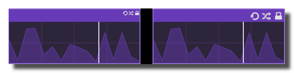
cursor position
Position of the cursor. Use -1 to set the cursor invisible.
cursor out
Cells output at the cursor position.
cursor mode
Determines the orientation of the cursor, by line, or columns.
save to file
Prompt for a file name and save the values to a text file ordered line by line.
load from file
Prompt for a file name and load the values to a text file ordered line by line.
file loaded
Sends a 1 value when the file is loaded. Must be connected to a flow-from-0-to-1.
save load headers in files
Determines if the columns and lines headers are also saved/loaded during the save to file and load from file operations.
file extension
Extension of the file name used for the load and save operations.
scroller pos V
Gets or Sets the vertical scroller position.
scroller pos H
Gets or Sets the horizontal scroller position.
clicked column
Latest clicked column number starting at the index 0 (line headers). Sends -1 if nothing has been clicked.
clicked line
Latest clicked line number starting at the index 0 (column headers). Sends -1 if nothing has been clicked.
clicked index
Index of the latest clicked cell starting at the index 0. The index is the position in the output array. Sends -1 if nothing has been clicked.
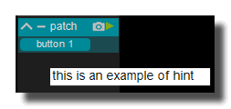
hint
Hint text displayed on mouse over.
matrix
Matrix design settings.
global
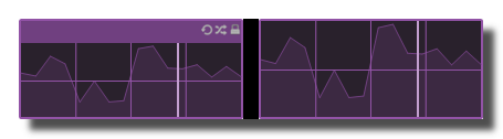
items margin
Margin between items.
adjust client size
Automatically adjusts the items size to fit the client area.
mouse over effect
Displays a visual effect when the mouse is over an item.
mouse over color
Color of the mouse over effect.
cursor color
Color of the selection cursor.
cells
items width
Width of the items in the matrix.
items height
height of the items in the matrix.
items round size
Round size of the items corners.
items align
Alignment of the items in their cells.
- center
- left
- right
items font color
Color of the items font.
items font size factor
Font size factor of the items font.
items background color
Color of the items background.
items foreground color
Color of the items foreground.
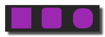
items draw mode
Items draw mode.
- square
- circle
items circle line width
Width of the circle line when items draw mode is set to circle.
headers
show line headers
Display line headers.
line headers width
width of the line headers.
line headers round size
Round size of the line headers corners.
line headers align
Alignment of the line headers text.
- center
- left
- right
line headers font color
Color of the line headers font.
line headers font size factor
Size factor of the line headers font.
line headers font bold
Whether the line headers font is bold or not.
line headers background color
Color of the line headers background.
show column headers
Display column headers.
column headers height
Height of the column headers.
column headers round size
Round size of the column headers corners.
column headers align
Alignment of the column headers text.
- center
- left
- right
column headers font color
Color of the column headers font.
column headers font size factor
Size factor of the column headers font.
column header font bold
Whether the column headers font is bold or not.
column headers vertical caption
Whether the column headers caption is displayed vertically or not.
column headers background color
Color of the column headers background.
Other Settings
hint
Hint text displayed on mouse over.
background
background color
Background color of the control.
transparent option must be OFF.
 Blue background color example.
transparent
Determines if the background of the control is transparent or not.
 Example, the first module is transparent.
remote highlight color
Background color when the control is modified by a remote (MIDI,OSC,etc.).
image file
Optional Filename of the background image.
Only PNG, JPEG and BMP formats are supported.
Use [ctrl+click] to reset.
 Example on an panel-xy-pad.
image fit mode
Force the image file to adapt its displayed size to the size of the object.
- proportional: the image keeps its proportion ratio and is left aligned,
- scaled: the image is scaled to the object size,
- original: keeps the original size
- clipped: the image is clipped to the object size, and centered,
- scaled: the image is scaled to the object size taking into account the border-size of the control.
svg filename
Name of the svg file to draw in background.
svg fill color
Color used to fill the svg.
svg stroke color
Color used to draw the contour of the svg.
For switches only, a second set of colors is used when the switch is OFF.
svg stroke width
Width of the stroke used to draw the contour.
Use 0 to disable the drawing of the contour.
svg margin
Margin used to draw the svg file.
svg keep aspect ratio
When the svg is stretched to the destination size, determines if it keeps its aspect ratio or is stretch to fit to the target rectangle.
border
show border
Displays or not the border of the control.
 8 pixels border on an panel-xy-pad.
border width
Sets the border width of the control in pixel.
8 pixels border on an panel-xy-pad.
border color
Border color of the control.
 a yellow border on an panel-xy-pad.
border OFF color
Border color when the control is OFF.
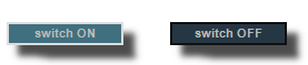 a black OFF border on a switch.
border ON color
Border color when the control is ON.
a white ON border on a switch.
round size
Thickness of rounded corners.
0 = no rounded corners.
 Example on a panel-shape.
don't draw selection border
Enables or disables the drawing of a border when the control is selected with the mouse.
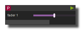
caption
show caption
Displays or not the caption.
 Example on a fader.
caption horizontal align
Caption alignment of the control, left, center or right.
caption vertical align
Vertical alignment of the caption, center, top or bottom.
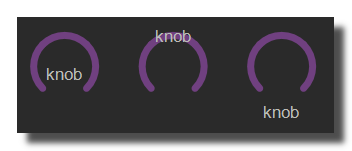 Example on knob: Center, top and bottom.
 Example on switch.
caption font size factor
Size multiplication factor applied to the caption font.
 Example on switch.
caption font
Font name of the control caption.
 Example with 3 different fonts on switch.
caption font color
Color of the caption font.
 Example on switch.
caption font italic
Italic style for caption font.
 Example on switch.
caption font bold
Bold style for caption font.
 Example on switch.
caption font underline
Underline style for the caption font.
 Example on switch.
frames
frames count
Number of frames in the background bitmap. See create your own knobs and faders.
frames alignment
Determines if the frames used in the background bitmap are aligned vertically or horizontally. See create your own knobs and faders.
global
mouse editing enabled
Determines if the control can be modified by the user. When OFF, the mouse interaction and modifications are disabled so the user can't change the value.
receive mouse info
When ON, the control receives mouse information (often called hit-test). This is useful when you want to detect mouse interactions on overlapping controls. Only the top control with receive mouse info ON will get the mouse events.
is visible
Sets or get the visibility of the control.
global color
Global color of the control. Usine will choose the best contrasted colors according the global color.
ignored in parent global color
When ON the global color of the control is not affected (is isolated) when the parent control global color changes.
design template name
Name of the snapshot (which contains the visual properties) loaded when the object is created. By default the snapshots files are located in /Resources/Templates/Design or /Config/Templates/Design.
the snapshot name can be without extension ie. LIGHT CLASS instead of LIGHT CLASS.tuknob_tab_design
z order
Determines the Z-order of the control
- normal: the Z-order is the control creation order
- front: the control appears always on top of all other controls
- back: the control appears always behind all other controls
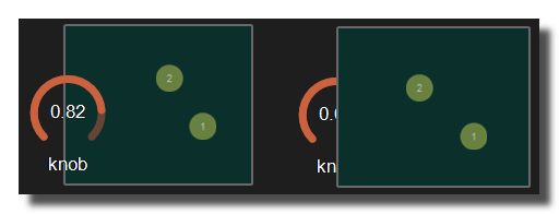 Example with the first knob on top.
opacity
Opacity value of the control.
0 will give a totally transparent control so invisible.
blur softness
Blur amount applied to the object.
 Example of blur.
Be careful, the blur softness use shaders which are not supported by all graphic cards.
Can crash Usine.
location
display location
Determines where the object is visible.
- invisible: the object is invisible.
- ctrl panel: in the control-panel.
- parent ctrl panel: in the control-panel of the parent patch if it exists.
- top ctrl panel : in the control-panel of the top parent patch (main patch) if it exists.
- container : in the container of the current patch.
- parent container : in the container of the parent patch of the current patch.
- top parent container: in the container of the top parent patch of the current patch.
- pop up window: visible in the popup.
- top header: visible in the top top-header-panel.
- toolbox: visible in the toolbox-panel.
- workspace: visible in the workspace-panel.
- additional container: visible in an additional container, identified by a number. See bellow.
When the location is set to a container which doesn't exist in the patch, Usine try to find in parent patches, the first container available. If no container is available an error message is displayed.
additional container
Sets the control as an additional container so any other control can be placed into that container. The additional container is identified by a number.
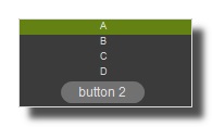 a button inside a listbox
also visible in interface builder
When ON, will also be visible in the interface-builder-panel.
mouse tab settings
Settings related to mouse, touch screen and drag&drop.
mouse & gesture
mouse dwn
Gives the mouse state of the control:
- 1 if the mouse is pressed
- 0 otherwise.
In multi-touch environment, can be an array of [0..1] values.
mouse wheel
Gives the mouse wheel speed and direction, -1,-2,-3,...=forward, 1,2,3,...=backward.
mouse wheel enabled
Enables or disable the mouse wheel action.
dbl click
Sends a 1 value if the user has [dbl-clicked] on the control.
mouse active
Determines if the mouse is active on the control.
mouse x
Gives the mouse X position on the control in relative coordinates from 0=most-left to 1=most-right.
In multi-touch environment, can be an array of [0..1] values.
mouse y
Gives the mouse Y position on the control in relative coordinates form 0=top to 1=bottom.
In multi-touch environment, can be an array of [0..1] values.
bitmap
See manipulate-bitmaps.
bitmap in
Background bitmap input.
Use [CTRL + Click] to reset the input.
bitmap out
Background bitmap output.
touch pressure
Pressure value on touch-screens.
The pressure value is not available on all touch screens.
gesture
Gesture information.
In touch and multi-touch environment, returns an array of the fingers movements See multi-touch
reset
auto reset
When ON, the value of the control is reset automatically on mouse up.
drag & drop
See using-drag-drop.
drag enabled
Enables the drag on this control.
allow drop
Enables or disables the drag&drop possibilities on this control.
drop file name
Name of the dropped file.
clear drop file name
Clears the latest dropped file name.
vertical mouse
When ON, move up-down to rotate a knob, left-right when OFF.
touch screen
touch hi precision
Mode of the precision factor. Can be disabled or for touch screen only or always (touch screen and mouse).
precision factor
Precision factor when the control is modified with a touch screen. Hi values for hi precision on touch screen.
mouse mode
Behavior of the control when it is modified with a touch screen.
circular mouse
When ON, the mouse wheel acts in circular mode.
keyboard arrows
keyboard arrows enabled
Determines if the control can be modified with the [arrow] keys of the keyboard.
focus & cursor
mouse over
Sends a 1 value when the control is hovered with the mouse.
mouse cursor
Determines the type of mouse cursor for the control.
- default
- none
- arrow
- cross
- beam
- size NESW
- size NS
- size NWSE
- size WE
- up arrow
- hour glass
- drag
- no drop
- H split
- V split
- multi drag
- SQL wait
- no
- app start
- help
- hand point
- size all
selection
selected
Sends 1 when the control is selected.
remote tab settings
Settings related to remote control assignation and learn.
general
clear all learn
Clear all the remotes assignations.
remote active
Enables or disables the remotes assignations.
inverse
Inverse the values received during the learn.
quantize
Quantization applied when state or value changes.
- no quantization,
- cycle,
- Bar,
- beat,
- 1/8,
- 1/16.
active mode
Determines when the remote assignations are active.
- always
- if rack is ON
- if rack is selected
- if patch is ON
- if patch is selected
bind buses
See binds-panel.
clear bind bus
Clear the current bind assignation.
binding
Set or get the bind name assignation.
bind controls
bind ID
ID of the bind control.
bind caption
Caption of the bind control.
clear bind control
Clear the current bind control assignation.
MIDI
start midi learn
Click on this button and move your MIDI controller to assign it.
device name
Name of the device associated to the MIDI learn.
Use [Ctrl+Click] to delete the name association so the MIDI learn will react with all the connected devices.
channel
MIDI channel used for the MIDI learn.
control num
MIDI Control message number (ie. Control Change, Note, etc) used for MIDI learn.
control type
MIDI message type used for the MIDI learn.
- None,
- NOTE OFF,
- NOTE ON,
- POLY AFTERTOUCH,
- CONTROL CHANGE,
- PROGRAM CHANGE,
- CHANNEL AFTER TOUCH,
- PITCH BEND.
midi mode
Choose between the 3 MIDI assignation modes in Usine.
- Absolute The controller sends a MIDI message with a value between 0 and 127 (typically rotary knob, fader). If you create a MIDIlearn NOTE ON on a switch, the value is set to 1 while the key is pressed and set to 0 when released. If you create a keylearn on a switch, the value is set to 1 while the key is pressed and set to 0 when released.
- Relative The controller sends a MIDI message with a positive value when you turn right and negative when left (typically endless knobs)
- Toggle The control toggles its minimum / maximum value each time it receives the learned code. Typically, if you want to assign a MIDI NOTE ON message, to an on/off parameter, for example, start playing a wave file while playing a MIDI keyboard note, you can toggle it on or off, when the same note is played again. On List box or integer faders, the Toggle mode increases the current value until the maximum is reached. Then restarts from the minimum value.
mackie mode
The control react as defined in the Mackie Control protocol. (when the control receives a MIDI message, the MIDI message is sent back to the controller to update its display/leds/fader position).
motorized
Only if you have motorized MIDI controllers connected. Force Usine to send MIDI messages to the connected remote devices and get a MIDI feedback.
soft take over
Soft Take Over if a control is moved on screen and it no longer matches the hardware control, the control will not update until the hardware control matches the onscreen value.
For instance say you have a line fader turned all the way up on the hardware, then you move the onscreen line fader to the bottom. With soft-takeover ON, the onscreen fader will not react to the line fader until you move the line fader all the way down to match the on screen value. The control will then latch on and will be active again.
sysex
System exclusive chain used for MIDI learn.
Key
start key learn
Click on this button and press a key (or a key combination ie. [ALT+E]) on your keyboard to assign it.
key
Key used for the key learn. Can be a key combination like [ALT+E], etc.
key mode
Determines how the Key learn affect the control, absolute or toggle.
shortcut
Key code value of the key learn.(ex: A=65)
mapping
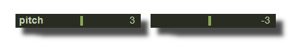
mapping curve
Curve type used for the mapping, log or exp, power curve, linear.
mapping curve coeff
Mapping curve coefficient.
mapping range max
Maximum range of the assignation.
mapping range min
Minimum range of the assignation.
OSC
start OSC learn
Click on this button and use a control of your OSC device to assign it.
OSC message
OSC message used for the OSC-learn.
OSC mode
Choose here between 2 modes, real OSC values received or force the values into the [0..1] range.
OSC tag order
This option is utilized to choose which tag to use when receiving multiple values simultaneously like in an XY values.
timecode
time code OFF
Time code learn, used to switch off a switch control.
time code ON
Time code learn, used to trig an action or to switch on a switch control.
VCA
vca
Name(s) of sources VCA's. One control can be controlled by several VCA at the same time so the VCA values are multiplied together.
To enter several names use comma separated string like VCA1,VCA2,VCA3.
See use-vca for more info.
clusters
cluster name
Name(s) of the owner cluster(s). One control can be in many clusters at the same time, but be aware that you could have conflicts (different value sent at the same time).
To enter several names use comma separated string like CLUSTER1,CLUSTER2,CLUSTER3.
See use-clusters for more info.
DMX
DMX universe
Universe number assigned for remote.
DMX channel
Channel number assigned for remote.
size tab settings
settings related to size and position of controls.
orientation
rotation angle
Rotation angle of the control.
is vertical
Rotates this control in vertical position.
zoom
zoom scale
Zoom scale of the control.
can zoom
Determines is the control can be zoomed with the wheel mouse.
Size & positions
top
Top position of the control in pixels.
left
Left position of the control in pixels.
height
Height of the control in pixels.
width
Width of the control in pixels.
percent
position percent x
Horizontal position in % [0..1] relative to the parent panel.
position percent y
Vertical position in % [0..1] relative to the parent panel.
height percent
Height in % [0..1] relative to the parent panel.
width percent
Width in % [0..1] relative to the parent panel.
resize grip
resize grip enabled
Determines if the control can be resized with the resize grip.
Interface Builder position
interface builder top
Top position in pixels in the interface-builder-panel.
interface builder left
Left position in pixels in the interface-builder-panel.
interface builder width
Width in pixels in the interface-builder-panel.
interface builder height
Height in pixels in the interface-builder-panel.
floating panel
floating x
Determines if the control is movable on X axis.
floating y
Determines if the control is movable on Y axis.
floating constrain to parent x
When ON the control stays inside the parent on X axis.
floating constrain to parent y
When ON the control stays inside the parent on Y axis.
resizable panel
resizable left
Determines if the control can be resized on its left hand.
resizable right
Determines if the control can be resized on its right hand.
resizable top
Determines if the control can be resized on its top hand.
resizable bottom
Determines if the control can be resized on its bottom hand.
physics
See physics-engine
physics enabled
Enables physics-engine in this panel.
physics speed
The physics speed of the control in physics-engine.
init with random speed
When ON, the physics-engine starts with a random speed for each child controls.
same masses
When ON, all controls have the same masses in the physics-engine.
ignored in physical engine
The position control is not affected by the physics-engine.
friction
Friction factor in the physics-engine.
elasticity
Energy conservation coefficient on collision.
gravity x
Gravity factor on the X axis.
gravity y
Gravity factor on the Y axis.
reset pos x
Position of the object when the physics engine is reset on X axis.
reset pos y
Position of the object when the physics engine is reset on Y axis.
reset positions
Process to reset the position of the control in the physics-engine.
angular speed
Angular speed of the control in the physical engine.
collide
Sends a 1 value when the control collides with another control or a border.
collide info
Gives information about the collide state in the physics-engine.
- 1001: top of the parent,
- 1002: right side of the parent,
- 1003: left side of the parent,
- 1004: bottom of the parent.
speed x
Speed vector value on the X axis in the physics-engine.
speed y
Speed vector value on the Y axis in the physics-engine.
minimize
minimized
Determines if the control is minimized or not.
reorganization
auto reorganize
Automatically reorganize positions of controls in the panel.
reorganize margin
Left margin used in reorganization, in pixels.
reorganize interspace H
Horizontal interspace between controls used in reorganization, in pixels.
reorganize interspace V
Vertical interspace between controls used in reorganization, in pixels.
auto resize options
auto resize
Resizes panels automatically when child controls are moved or resized. Switch it OFF if you use floating panels inside.
auto resize margin
Margin in pixel used for the auto resize option.
force reorganize
Forces the reorganization of controls in the panel.
fit standard size
Adjust the panel width to a multiple of the default rack width.
align to grid
snap to grid
In unlock mode, snap the control to a grid.
grid size
Grid size in pixels when snap to grid is ON.
curve tab settings
Settings related to automation curve recording and playback.
curve
auto record on click
When ON, the automation recording starts automatically when click on the control.
delete curve
Deletes the automation curve.
is playing record
Sends 1 value when the control is playing a recorded automation curve.
header toolbar
show toolbar
Displays the toolbar with its icons.
 Example ON and OFF
toolbar size factor
Height of the toolbar % of the global height.
 Example toolbar size on a panel.
header
show header
Displays or not the header on the panel.
 Example on sequenced-lines.
header height
Height of the header in pixels.
header color
Background color of the header.
solid header color
Determines if the header is drawn as a plain bar (HH5 style) or as small bar in the upper left corner.
 plain ON
 plain OFF
saved in preset
Determines if parameters of this object are saved in the preset-panel.
fade preset
Parameters of the this object can cross faded when you recall a preset in the grid.
Optional setting, does not appear on all objects.
can be randomized
When ON, this object will be randomized when using the randomize command.
can be reset
When ON, this object will be reset to its default value when using the reset command of its patch.
horizontal scroller
show horizontal scroller
Determines if the horizontal scroller is visible or not.
The scroller appears only if the container is smaller than the controls inside.
 Example of horizontal scroller
horizontal scroller height
Height of the scroller in pixels.
horizontal scroller color
Scroller color.
horizontal scroller back color
Scroller background color.
horizontal scroller opacity
Scroller opacity.
vertical scroller
show vertical scroller
Determines if the vertical scroller is visible or not.
The scroller appears only if the container is smaller than the controls inside.
vertical scroller width
Height of the scroller in pixels.
vertical scroller color
Scroller color.
vertical scroller back color
Scroller background color.
vertical scroller opacity
Scroller opacity.
Common Settings
info
show manual
Opens the web browser to display information or help about the selected object, if it exists.
For more details about information/help creation, see create-help-file.
description
Description of the module for internal help purposes only. The description is not displayed in the interface.
ID's
visible only in god mode, see setup-panel-tab-expert.
unique ID
Current private ID for this control used to identify the object.
preset ID
Current private preset ID for this control used for presets.
recreate ID
If you experience difficulties in Polyphonic mode, try to recreate new id(s) with this button.
repair ID s
Each Patch shared on the local network uses its own ID (identification number). If you experience issues of Patches that don't send information to the good target, this button will rebuild all these id's.
Object Remote Address
absolute
Absolute remote address. see objects-address.
local
Local to the current patch remote address. see objects-address.
user addr
User defined remote address. see objects-address.
See also
- Point3D Matrix Array to 3D Points
- Points3D Points to Matrix Array
- MIDI Mix Matrix
- Audio Mix Matrix
- Panel Array Editor String
- Panel Matrix
- Panel Array Editor Data
Common Settings
info
show manual
Opens the web browser to display information or help about the selected object, if it exists.
For more details about information/help creation, see create-help-file.
description
Description of the module for internal help purposes only. The description is not displayed in the interface.
ID's
visible only in god mode, see setup-panel-tab-expert.
unique ID
Current private ID for this control used to identify the object.
preset ID
Current private preset ID for this control used for presets.
recreate ID
If you experience difficulties in Polyphonic mode, try to recreate new id(s) with this button.
repair ID s
Each Patch shared on the local network uses its own ID (identification number). If you experience issues of Patches that don't send information to the good target, this button will rebuild all these id's.
Object Remote Address
absolute
Absolute remote address. see objects-address.
local
Local to the current patch remote address. see objects-address.
user addr
User defined remote address. see objects-address.
See also
version 7.0.250121
Edit All Pages