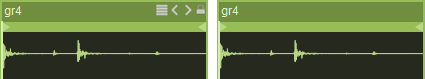
Data Generator Sequenced Triggers
Generates a sequence of Triggers values according to a list of buttons.

To reset values use the [ctrl] key.
To shift values left or right use the [shift] key.
To shift values up or down use the [shift+ctrl] key.
Settings
on
Activates or deactivates the module.
out
Output Data flow(s).
synchro
Synchronization options which determines the way the object is triggered, or the sequence is played.
Generally the following options are available:
- button: when the button play receives a 1 trigger,
- interval: according the interval fader,
- duration: according the duration fader,
- loop: the sequence is played in a loop mode,
- cycle: each beginning cycle,
- bar: each beginning bar,
- beat: each beat,
- 8th: each 1/8th,
- etc.
play
Plays the sequence.
this input works only when the synchro=button
stop
Stops playing the sampler or the sequence.
this input works only when the synchro=button
step pos
Current step position.
restart
Resets the step pos to 0.
this input works only when the synchro=button.
next step
Goes to the next step.
num of steps
Number of steps.
 Example with 4 and 16 steps.
duration
Sequence duration in ms.
This input works only when the synchro=loop.
randomize
Randomizes values of the selected object.
Only visible controls can be randomized.
reset
Resets all the values of the selected object.
It resets to the reset value value for controls and to their default values for panels.
lock
Locks the user interface to prevent any modification.
caption
Displayed caption of the object. Click to enter a new name.
val
Separated values.
values
Values packed as an Array, to set or get.
saved in preset
Determines if parameters of this object are saved in the preset-panel.
fade preset
Parameters of the this object can cross faded when you recall a preset in the grid.
Optional setting, does not appear on all objects.
can be randomized
When ON, this object will be randomized when using the randomize command.
can be reset
When ON, this object will be reset to its default value when using the reset command of its patch.
Other Settings
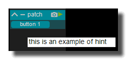
hint
Hint text displayed on mouse over.
background
background color
Background color of the control.
transparent option must be OFF.
 Blue background color example.
transparent
Determines if the background of the control is transparent or not.
 Example, the first module is transparent.
hilited color
Background color when the control is modified by a remote (MIDI,OSC,etc.).
image file
Optional Filename of the background image.
Only PNG, JPEG and BMP formats are supported.
Use [ctrl+click] to reset.
 Example on an panel-xy-pad.
fit size
Force the image file to adapt its displayed size to the size of the object.
- proportional: the image keeps its proportion ratio and is left aligned,
- scaled: the image is scaled to the object size,
- original: keeps the original size
- clipped: the image is clipped to the object size, and centered,
- scaled: the image is scaled to the object size taking into account the border-size of the control.
Bitmaps
See manipulate-bitmaps.
bitmap in
Background bitmap input.
Use [CTRL + Click] to reset the input.
bitmap out
Background bitmap output.
border
show border
Displays or not the border of the control.
 8 pixels border on an panel-xy-pad.
border width
Sets the border width of the control in pixel.
8 pixels border on an panel-xy-pad.
border color
Border color of the control.
 a yellow border on an panel-xy-pad.
border OFF color
Border color when the control is OFF.
 a black OFF border on a switch.
border ON color
Border color when the control is ON.
a white ON border on a switch.
round size
Thickness of rounded corners.
0 = no rounded corners.
 Example on a panel-shape.
don't draw selection border
Enables or disables the drawing of a border when the control is selected with the mouse.
caption
show caption
Displays or not the caption.
 Example on a fader.
caption align
Caption alignment of the control, left, center or right.
caption V align
Vertical alignment of the caption, center, top or bottom.
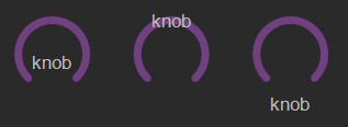 Example on knob: Center, top and bottom.
 Example on switch.
caption font size factor
Size multiplication factor applied to the caption font.
 Example on switch.
caption font
Font name of the control caption.
 Example with 3 different fonts on switch.
caption font color
Color of the caption font.
 Example on switch.
caption font italic
Italic style for caption font.
 Example on switch.
caption font bold
Bold style for caption font.
 Example on switch.
caption font underline
Underline style for the caption font.
 Example on switch.
drag & drop
See using-drag-drop.
drag enabled
Enables the drag on this control.
allow drop
Enables or disables the drag&drop possibilities on this control.
drop file name
Name of the dropped file.
clear drop file name
Clears the latest dropped file name.
global
edition enabled
Determines if the control can be modified by the user. When OFF, the mouse interaction and modifications are disabled so the user can't change the value.
is visible
Sets or get the visibility of the control.
global color
Global color of the control. Usine will choose the best contrasted colors according the global color.
ignored in parent global color
When ON the global color of the control is not affected (is isolated) when the parent control global color changes.
snapshot name
Name of the snapshot (which contains the visual properties) loaded when the object is created. By default the snapshots files are located in /Resources/Snapshots/ or /Config/Snapshots.
the snapshot name can be without extension ie. LIGHT CLASS instead of LIGHT CLASS.tuknob_tab_design
on top
Determines the Z-order of the control
- normal: the Z-order is the control creation order
- on top: the control appears always on top of all other controls
- backward: the control appears always behind all other controls
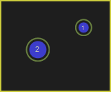
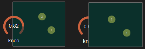 Example with the first knob on top.
opacity
Opacity value of the control.
0 will give a totally transparent control so invisible.
blur softness
Blur amount applied to the object.
 Example of blur.
Be careful, the blur softness use shaders which are not supported by all graphic cards.
It can crash Usine.
header
show header
Displays or not the header on the panel.
 Example on sequenced-lines.
header height
Height of the header in pixels.
header color
Background color of the header.
plain header
Determines if the header is drawn as a plain bar (HH5 style) or as small bar in the upper left corner.
 plain ON
 plain OFF
horizontal-scroller
show H scroller
Determines if the horizontal scroller is visible or not.
The scroller appears only if the container is smaller than the controls inside.
 Example of horizontal scroller
h scroller height
Height of the scroller in pixels.
h scroller color
Scroller color.
h scroller opacity
Scroller opacity.
ID's
visible only in god mode, see setup-panel-tab-expert.
unique ID
Current private id for this control.
recreate ID
If you experience difficulties in Polyphonic mode, try to recreate new id(s) with this button.
repair ID s
Each Patch shared on the local network uses its own ID (identification number). If you experience issues of Patches that don't send information to the good target, this button will rebuild all these id's.
info
show info
Opens the web browser to display information's or help about the selected object, if it exists.
For more details about information/help creation, see create-help-file.
location
where
Determines where the object is visible.
- invisible: the object is invisible.
- ctrl panel: in the control-panel.
- parent ctrl panel: in the control-panel of the parent patch if it exists.
- top ctrl panel : in the control-panel of the top parent patch (main patch) if it exists.
- container : in the container of the current patch.
- parent container : in the container of the parent patch of the current patch.
- top parent container: in the container of the top parent patch of the current patch.
- pop up window: visible in the popup.
- top header: visible in the top top-header-panel.
- toolbox: visible in the toolbox-panel.
- workspace: visible in the workspace-panel.
- additional container: visible in an additional container, identified by a number. See bellow.
When the location is set to a container which doesn't exist in the patch, Usine try to find in parent patches, the first container available. If no container is available an error message is displayed.
is additional container
Sets the control as an additional container so any other control can be placed into that container. The additional container is identified by a number.
 a button inside a listbox
also visible in IB
When ON, will also be visible in the interface-builder-panel.
mouse
mouse dwn
Gives the mouse state of the control:
- 1 if the mouse is pressed
- 0 otherwise.
In multi-touch environment, can be an array of [0..1] values.
mouse wheel
Gives the mouse wheel speed and direction, -1,-2,-3,...=forward, 1,2,3,...=backward.
mouse wheel enabled
Enables or disable the mouse wheel action.
dbl click
Sends a 1 value if the user has [dbl-clicked] on the control.
mouse active
Determines if the mouse is active on the control.
mouse y
Gives the mouse X position on the control in relative coordinates from 0=most-left to 1=most-right.
In multi-touch environment, can be an array of [0..1] values.
mouse x
Gives the mouse Y position on the control in relative coordinates form 0=top to 1=bottom.
In multi-touch environment, can be an array of [0..1] values.
touch pressure
Pressure value on touch-screens.
The pressure value is not available on all touch screens.
gesture
Gesture information's.
In touch and multi-touch environment, returns an array of the fingers movements See multi-touch
auto reset
When ON, the value of the control is reset automatically on mouse up.
vertical mouse
When ON, move up-down to rotate a knob, left-right when OFF.
mouse over
Sends a 1 value when the control is hovered with the mouse.
mouse over
Sends 1 when the control is mouse overed.
selected
Sends 1 when the control is selected.
Size, positions
top
Top position of the control in pixels.
left
Left position of the control in pixels.
height
Height of the control in pixels.
width
Width of the control in pixels.
position x
Horizontal position in % [0..1] relative to the parent panel.
position y
Vertical position in % [0..1] relative to the parent panel.
heightpc
Height in % [0..1] relative to the parent panel.
widthpc
Width in % [0..1] relative to the parent panel.
iB top
Top position in pixels in the interface-builder-panel.
iB left
Left position in pixels in the interface-builder-panel.
iB width
Width in pixels in the interface-builder-panel.
iB height
Height in pixels in the interface-builder-panel.
rotation angle
Rotation angle of the control.
vertical
Rotates this control in vertical position.
zoom scale
Zoom scale of the control.
can zoom
Determines is the control can be zoomed with the wheel mouse.
resize grip enabled
Determines if the control can be resized with the resize grip.
minimized
Determines if the control is minimized or not.
floating x
Determines if the control is movable on X axis.
floating y
Determines if the control is movable on Y axis.
floating content parent x
When ON the control stays inside the parent on X axis.
floating content parent y
When ON the control stays inside the parent on Y axis.
TpgControl_Button.floating content parent y
resizable left
Determines if the control can be resized on its left hand.
resizable right
Determines if the control can be resized on its right hand.
resizable top
Determines if the control can be resized on its top hand.
resizable bottom
Determines if the control can be resized on its bottom hand.
Physics-engine
See physics-engine
physics enabled
Enables physics-engine in this panel.
physics speed
The physics speed of the control in physics-engine.
init with random speed
When ON, the physics-engine starts with a random speed for each child controls.
same masses
When ON, all controls have the same masses in the physics-engine.
ignored in physical engine
The position control is not affected by the physics-engine.
friction
Friction factor in the physics-engine.
elasticity
Energy conservation coefficient on collision.
gravity x
Gravity factor on the X axis.
gravity y
Gravity factor on the Y axis.
reset pos x
Position of the object when the physics engine is reset on X axis.
reset pos y
Position of the object when the physics engine is reset on Y axis.
angular speed
Angular speed of the control in the physical engine.
collide
Sends a 1 value when the control collides with another control or a border.
collide info
Gives information about the collide state in the physics-engine.
- 1001: top of the parent,
- 1002: right side of the parent,
- 1003: left side of the parent,
- 1004: bottom of the parent.
speed x
Speed vector value on the X axis in the physics-engine.
speed y
Speed vector value on the Y axis in the physics-engine.
Layouts
auto reorganize
Automatically reorganize positions of controls in the panel.
reorganize margin
Left margin used in reorganization, in pixels.
reorganize interspace
Interspace between controls used in reorganization, in pixels.
auto resize
Resizes panels automatically when child controls are moved or resized. Switch it OFF if you use floating panels inside.
auto resize margin
Margin in pixel used for the auto resize option.
fit standard size
Adjust the panel width to a multiple of the default rack width.
snap to grid
In unlock mode, snap the control to a grid.
grid size
Grid size in pixels when snap to grid is ON.
toolbar
show toolbar
Displays the toolbar with its icons.
 Example ON and OFF
toolbar size factor
Height of the toolbar % of the global height.
 Example toolbar size on a panel.
steps
step color
Color of the steps.
step opacity
Opacity of the steps.
show mouse cross
Displays the mouse cursor as "cross".
full cursor width
When ON, the cursor width is equal to the steps width.
big step color
Color for the big steps according the big step interval parameter.
 Example with big steps in Blue.
big step interval
Interval between two big steps.
Example with interval=7
show step border
Displays the step border.
 With border
 Without border
step border color
Border color
Only if show step border is ON.
 blue border
step color
Color of the steps.
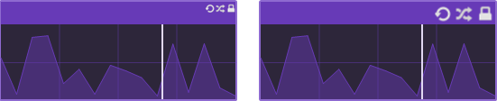
draw mode
Determines how the module draws the steps.
4 modes are available:
Draw bars
 Draw symmetric
 Draw small bar
 Draw lines
mode fill
Fill the form with color.
 Mode fill ON and OFF
fill color
Color used to fill lines.
 Blue fill color
fill opacity
Determines the fill opacity.
Only when mode fill is ON.
 Example with 2 different opacity values.
horizontal scale
Sets the horizontal scale for the steps: normal or logarithmic.
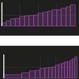 Example for normal and log
line color
Color of the lines.
 Yellow line on a data-generator-sequenced-lines.
line width
Line width (thickness) in pixels.
 *pixel and 4 pixels line on a data-generator-sequenced-lines.
pixel color
Color used to draw pixels and lines.
pixel size
Size used to draw pixels or lines.
point size
Size of selector points in pixels.
 Example of different sizes on a sequenced-points-curve.
points color
Color of the selector points.
 Example on a sequenced-points-curve.
select tolerance
Precision tolerance in pixels for the point selection.
show points
Displays or not the selector points on the curve.
 Option ON and OFF
vertical scale
Vertical scale for the steps: normal, logarithmic or exponential.
 Example for normal, logarithmic and exponential
display value on mouse over
Displays the value of the current step or point on mouse over.
Cursor
show cursor
Displays a small cursor indicator at current position.

cursor color
Color of the cursor.
cursor width
Cursor width in pixels.
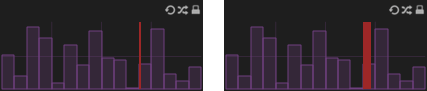 2 and 8 pixels cursor on a data-generator-sequenced-steps.
cursor opacity
Opacity of the cursor.
Grid
show grid
Displays or not a grid on the panel.
 Example with 8 x 4 grid.
full grid size
Displays a full grid when ON or just small ticks when OFF on the panel.
 Example OFF and ON.
grid color
Color of the grid.
 Example with a Yellow grid on a data-generator-sequenced-steps.
h divisions
Number of vertical tick of the grid.
0 = no grid division visible
 Horizontal division set to 8 on a data-generator-sequenced-steps.
v divisions
Number of horizontal tick of the grid.
0 = no grid division visible
Example of 4 vertical divisions.
vertical lock
When ON the control can be modified, with the mouse, only vertically.
See also
version 6.0.240115
Edit All Pages